New UX and product pages for sink manufacturers

Expertise
Tech Stack
Awards
Challenge
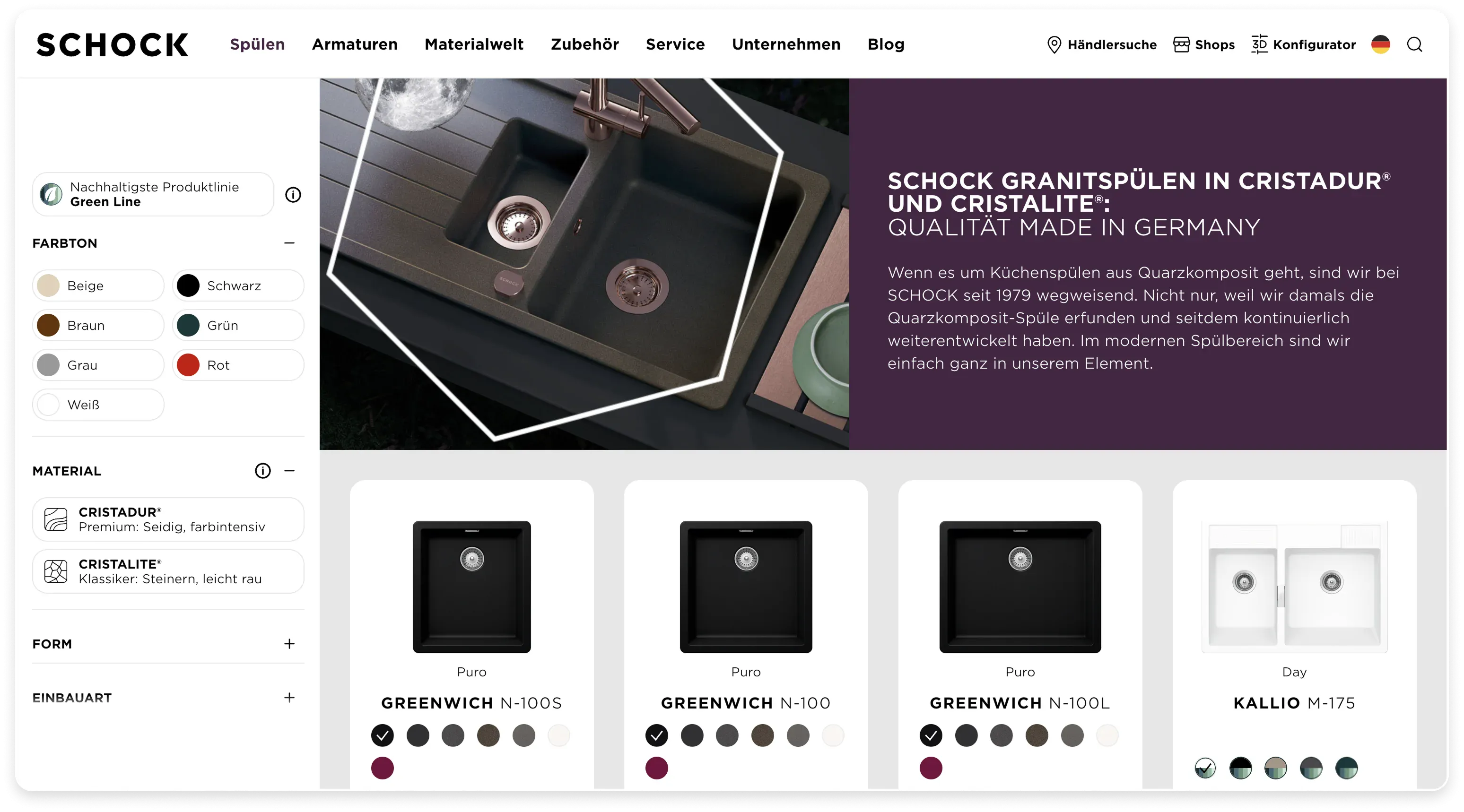
SCHOCK wanted to modernise its website to improve the user experience and present the company's unique products in an appealing way. At the same time, the website needed to be more user-friendly and lively.
Solution
We developed a clear design system, improved the navigation and product filtering and expanded the product worlds with interactive hotspots.


From usability to a positive experience
Anyone who knows SCHOCK knows that SCHOCK is different. ‘Colour your life’ is not only reflected in the claim and the company's attitude, but also in its entire external communication. The combination of the refreshing approach and the company's openness to trying out new things immediately impressed us.
After an extensive usability check of the website, the first facelift of SCHOCK.de was carried out based on the resulting optimisation results. In addition to fixing minor bugs and optimising the responsiveness of the website, we made sure that SCHOCK's exceptional interface was presented in a clear design system.
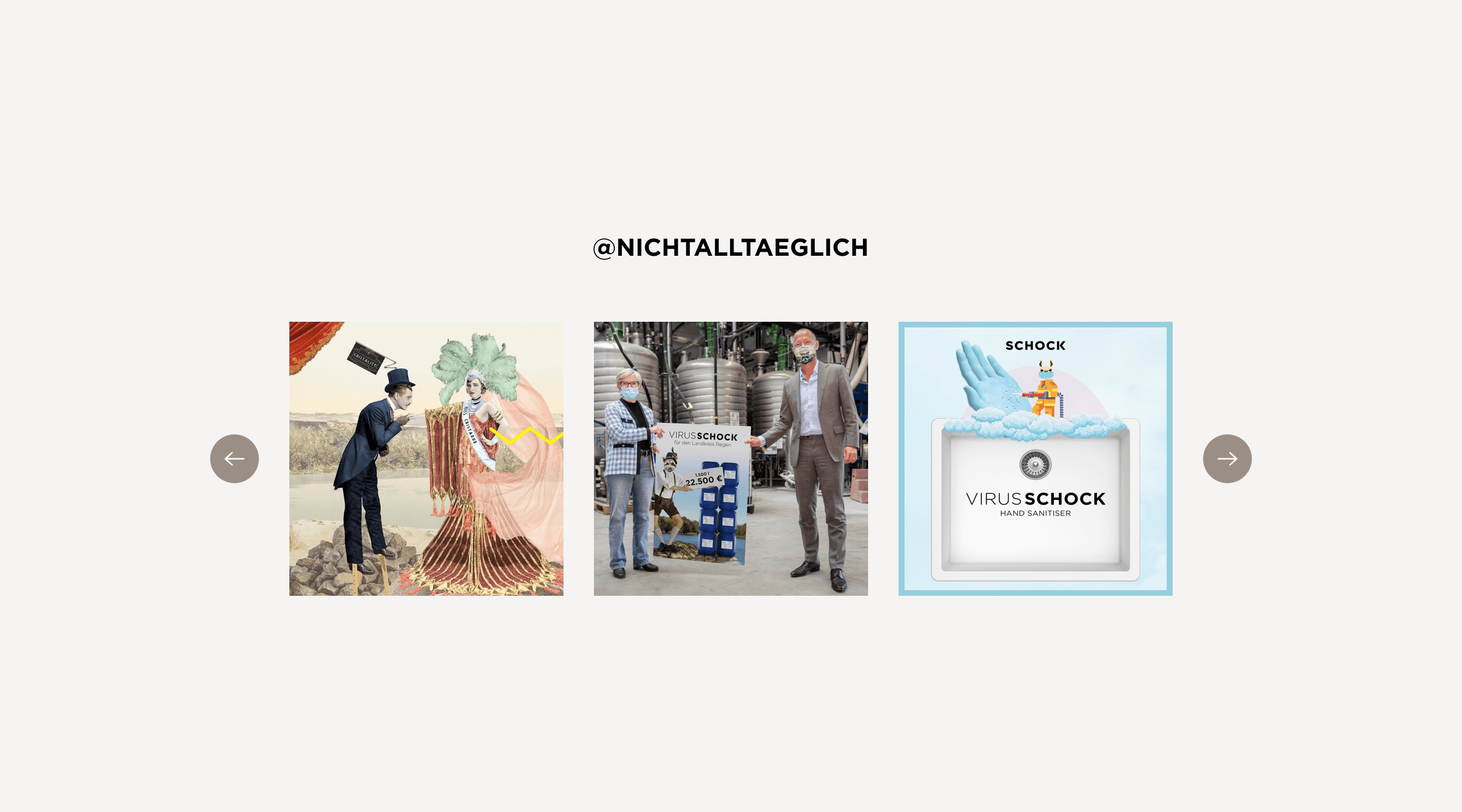
And of course, we also had to improve the general user experience. To do this, we once again put ourselves in the target group's shoes and rethought existing modules from the user's perspective. Among other things, we then designed a new entry point on the homepage, improved the navigation and expanded the product worlds with interactive hotspot sections to illustrate the combination of products instead of just displaying them individually. To bring more life to the website in general, we integrated animations and inspiration areas with social media walls.

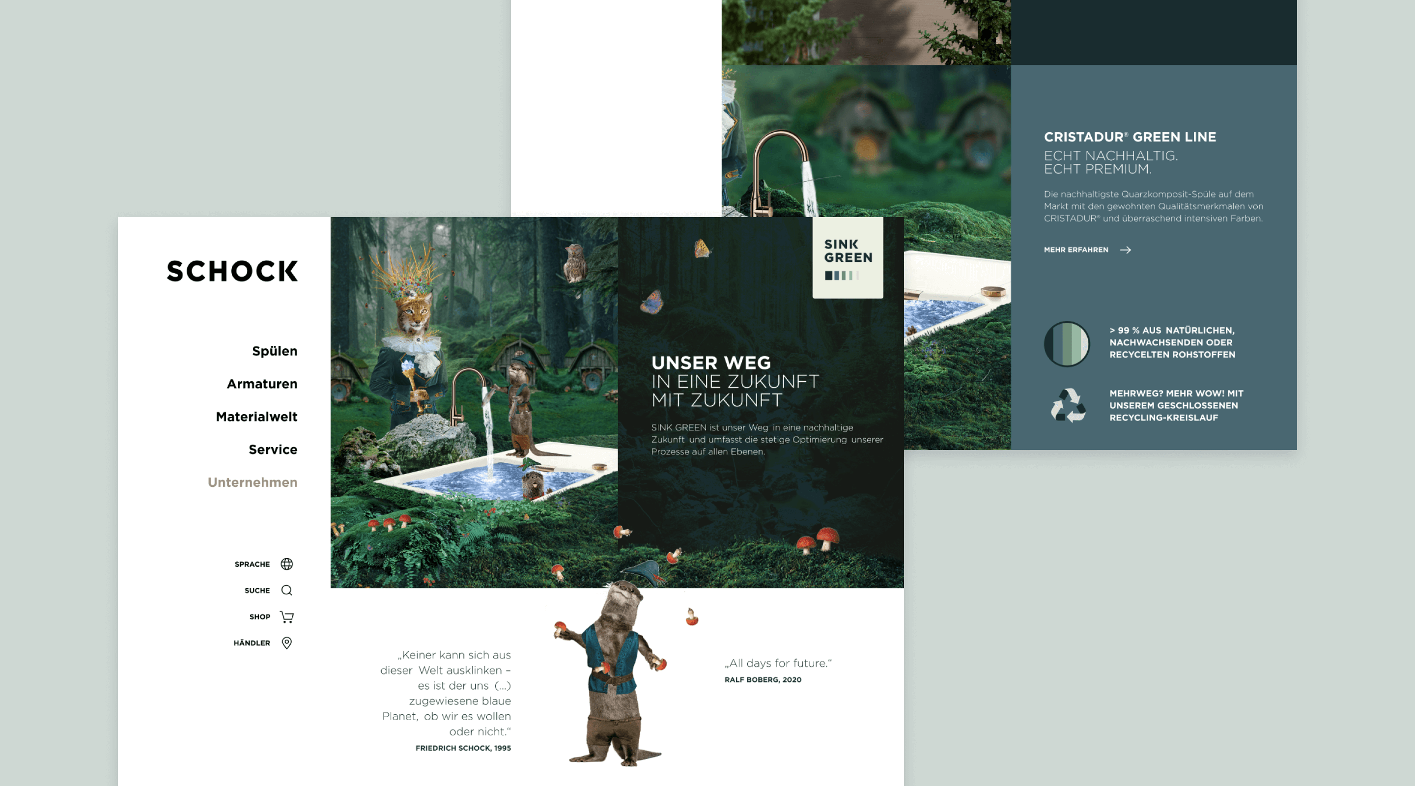
Interactive online worlds for new product lines
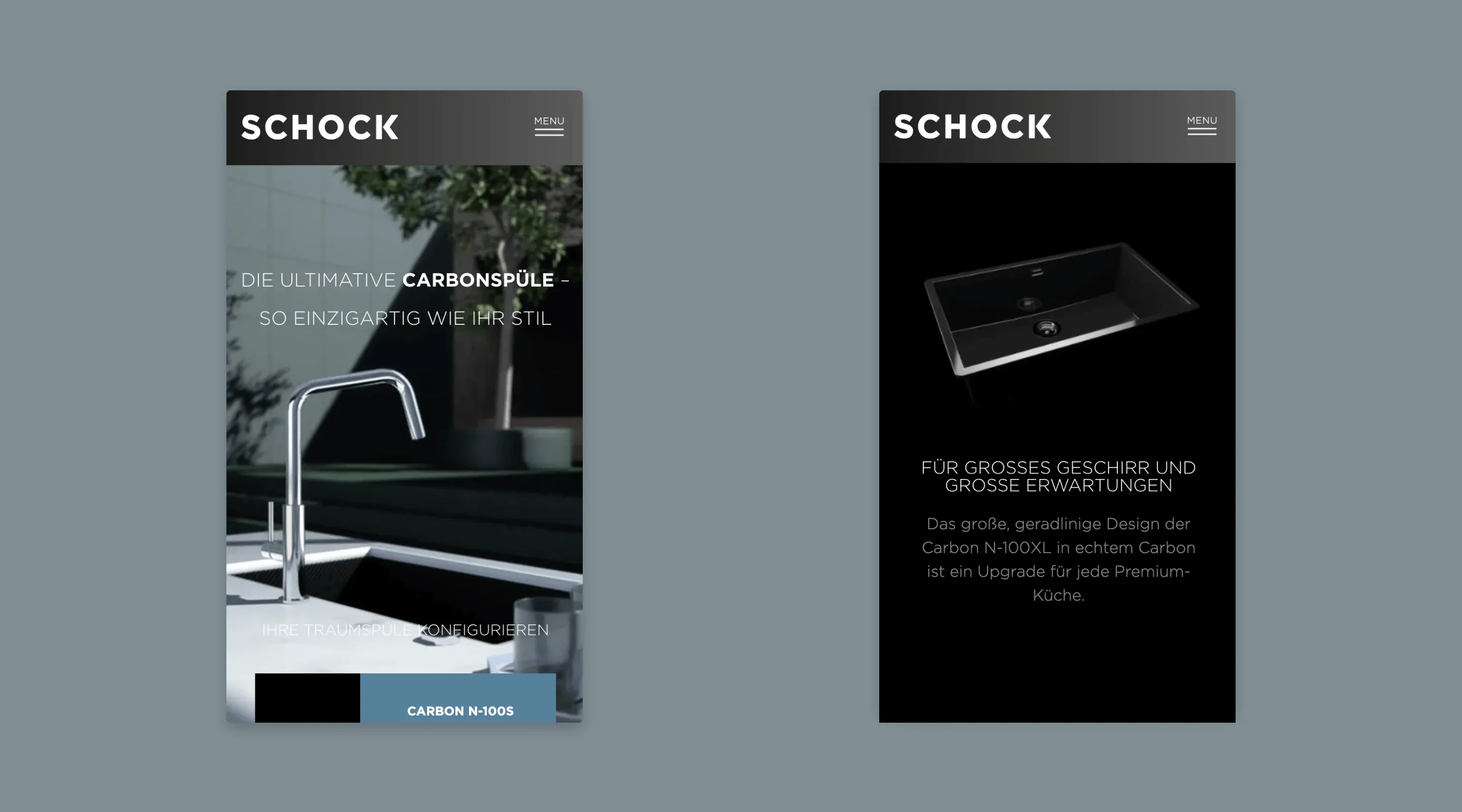
In addition to the facelift, we implemented the digital communication of the two new products ‘Carbon’ and ‘SINK GREEN’ on their own websites. The challenge: While SCHOCK Carbon is a luxury product, the SINK GREEN sink stands for sustainability and recycling - both product lines therefore required a very different communication strategy and user experience. The Carbon site therefore impresses with an elegant interface and modern 3D scroll animations of the carbon sink in ‘Apple style’. SINK GREEN, on the other hand, is characterised by its remarkable visual language, storytelling approach and lively animated content.
The technology behind it
The website, which is very extensive overall, has a complex interface for importing product data from the internal system and not only automatically imports the products themselves, but also takes product configurators, filters, etc. into account. For the extensions and customisations we created, we familiarised ourselves with the existing system and developed it further. We created the microsites for the product lines using the existing NEOS installation. We created the 3D scroll animation of the carbon sink by inserting individual frames from 3D renderings, which are exchanged by scrolling and thus give the impression of an interactive video.