Branding & UX/UI for Social Metaverse App


Expertise
Challenge
Remote teams often lose a sense of connection, and working from home can quickly become lonely. The founders of Bonfire wanted to change exactly that and create a product that promotes a fun and interactive working world.
Solution
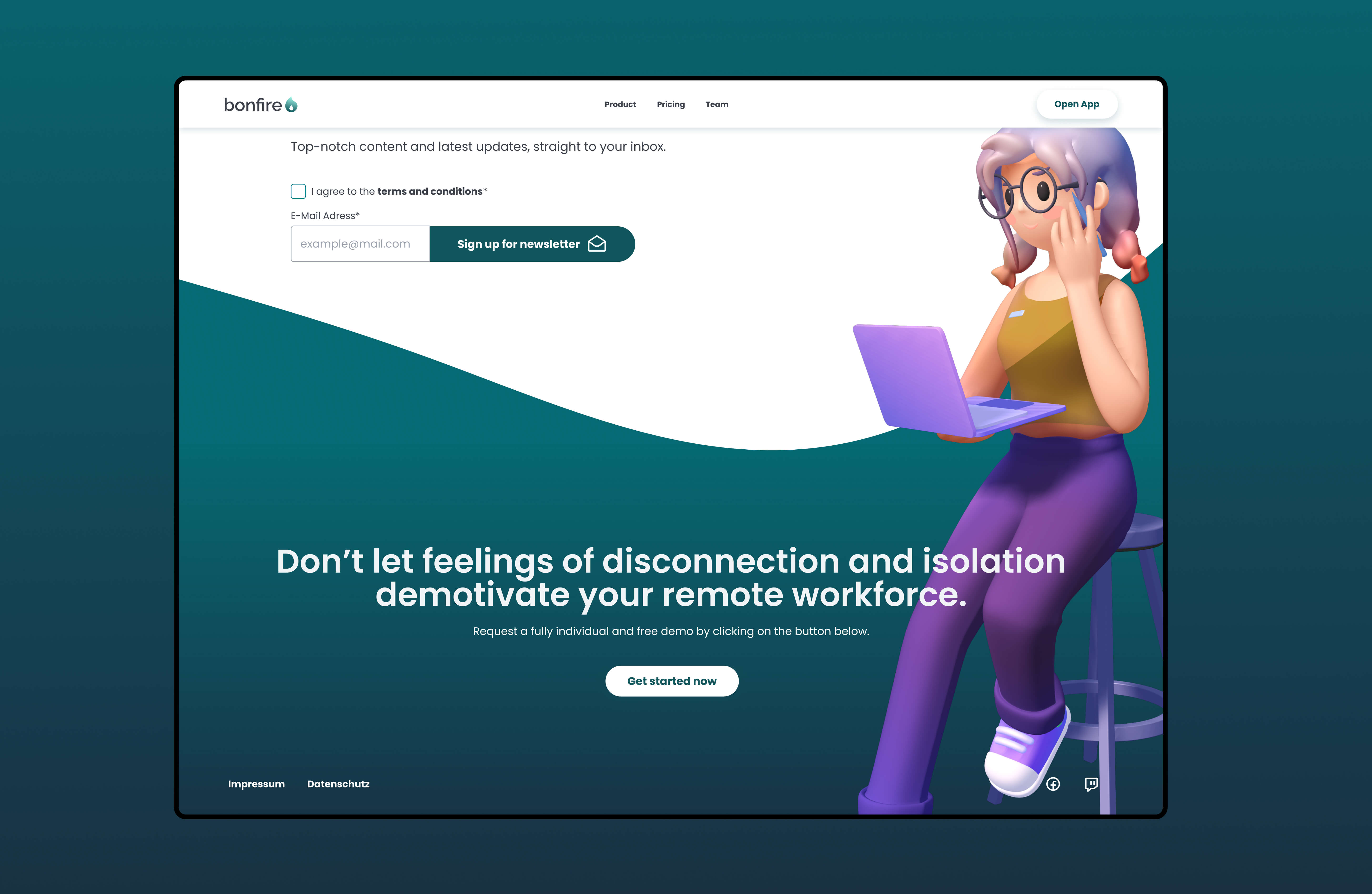
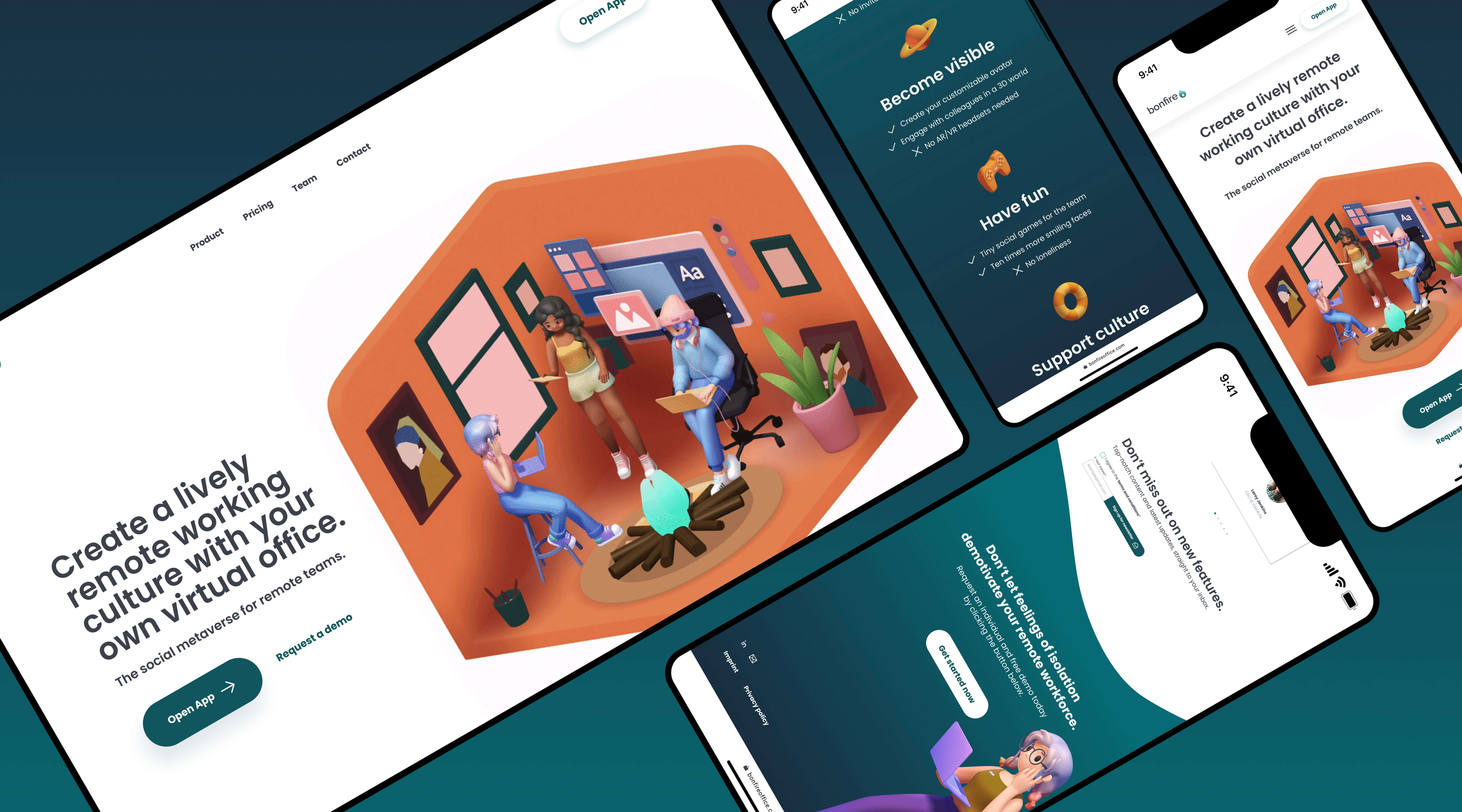
With a new landing page, a fresh corporate design and a thoughtful UX/UI analysis, the team has positioned the Bonfire app to promote social interaction and minimize isolation. Round shapes, playful elements and a harmonious color palette make the brand an emotional experience and the user journey a real experience.
Strategic UX Coaching
Together as a team, we carried out extensive UX coaching and a detailed analysis of the current status with Bonfire. Part of this workshop was a clear representation of the main user flows and an identification of the main pain points of the website. Building on this, we were able to work out which measures should be addressed in the short, medium or long term.
Fire Up Interest
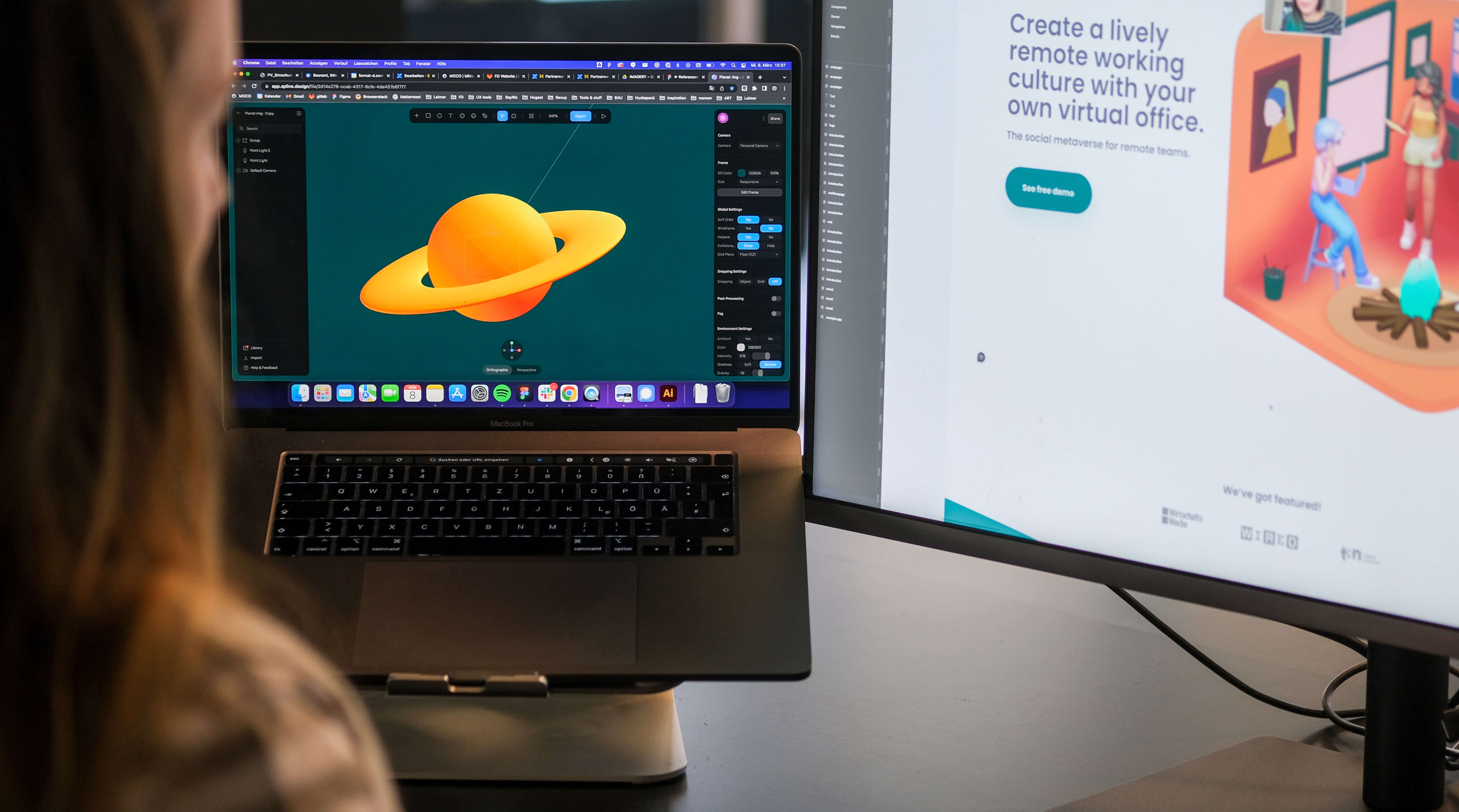
Building up on this strategic analysis, a concept for a new landing page was developed as an essential part of the user journey. The basis here was a comprehensive design system that provides orientation and structure for further work on the product.
The idea behind the concept was to make the Bonfire social meeting place and the brand emotionally tangible and tangible. The one-pager therefore values a playful UI with short but meaningful texts and a transparent insight into the app itself.

When the fire burns..
The strategic analysis, the repositioning of the brand, the structuring of the design and the development of the landing page should not be the end when working together brings so much joy and exciting tasks.
An ongoing UX/UI analysis of the components implemented by Bonfire, an optimization of the funnel or the conceptual development of a new onboarding process: We are pleased to be able to accompany the further development of the brand.
Further UX UI Improvements
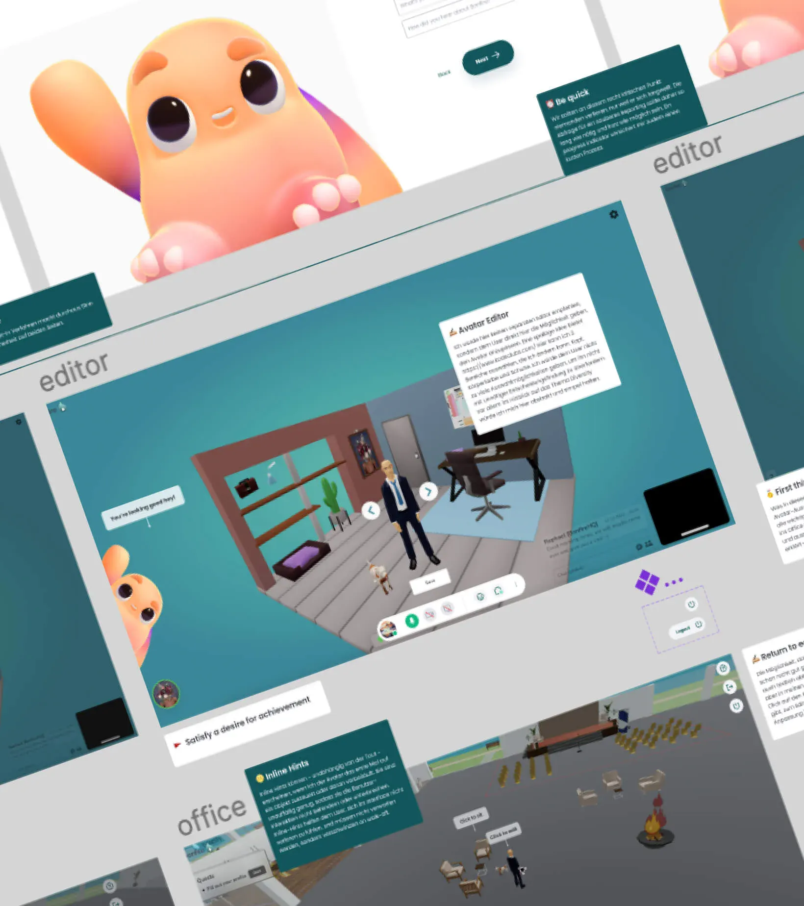
In order to optimize the funnel and improve the user experience within the app, a detailed UX/UI analysis of the already implemented components was carried out and the implementing development team was provided with advice. The entire user journey should feel like a handwriting and be fun for the user to use. Classic UX/UI principles, such as the principle of “staged disclosure”, provide the analytical and strategic basis and manifest the planned optimization measures.